Our art
The Artist
Brooke Sutton is a contemporary Aboriginal artist and proud Kalkadoon woman. Her passion for painting was ignited at the tender age of eight. Her talent was not only evident but also celebrated as she triumphed in numerous local art competitions and was commissioned for several artworks, all while still in school. This early recognition of her artistic prowess is a beacon of inspiration, a testament to her dedication and talent.

The Story
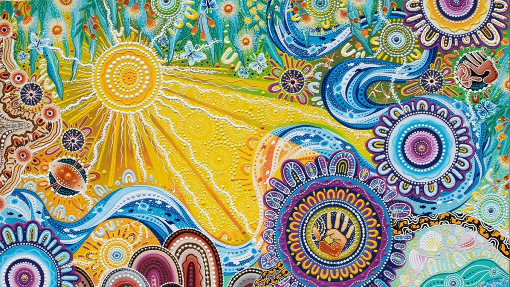
In my painting the largest community symbol with the handprint inside of it represents knowmore. The handprints within this community symbol represents Knowmore’s vision, which is “Access to justice for survivors of institutional sexual abuse”. The outermost ring of this community symbol, with the blue and purple U symbols around it represents Knowmore’s wider vision for a community that is accountable to survivors and free of child abuse. The sun in the top left corner of the painting represents creating a better and brighter future for their clients. The smaller sun rays represent Knowmore’s aim, which is to facilitate access to justice for victims and survivors of child abuse and to work with survivors and their supporters to stop child abuse and the largest rays lighting up Knowmore’s community symbol represents Knowmore being the light at the end of the tunnel for many of their clients.
The four yellow-orange and blue community symbols throughout the painting represents Knowmore’s four main services:
- Legal advice and assistance
- Support services
- Aboriginal and Torres Strait Islander support
- Financial counselling
The river running throughout the painting represents our corporate services, sustaining the rest of us to do our work and spreading the messages of Knowmore across the country. The water is known to change the landscape in the same way that our law reform and advocacy hope to do.
The footprints beginning on the right side of the painting represents victims and survivors of child abuse beginning their journey walking alone. They then discover Knowmore, and continue their journey from Knowmore’s community symbol walking together. These footprints represent the work of our intake and admin teams – the first to meet and support survivors.
The six smaller dotted white circles throughout the painting represents Knowmore’s offices in Sydney, Melbourne, Brisbane, Perth, Adelaide and Darwin and the U symbols around each of these circles represents Knowmore’s person centred, relationship based approach to supporting clients.
The boomerang inside of the dotted circle in the bottom left side of the painting represents Knowmore helping clients connect to where they are from and helping them to reclaim their culture. The shield and spears in the dotted circle above the boomerang represent preventing and protecting children from abuse and the ear and hand in the top right corner of the painting represents Knowmore listening to peoples’ stories.
The six purple and yellow stars throughout the painting represents what the organisation means to survivors. Knowmore is:
- Non judgemental
- Compassionate
- Trustworthy
- Culturally safe
- Multidisciplinary
- Trauma-informed
The sand and hills, the river, the ocean, and the leaves all represent Knowmore’s connection to freshwater, saltwater, rainforest, and desert. The kangaroo and emu footprints travelling throughout the sand represents Knowmore helping their clients achieve their future aspirations and the business using innovation to move forwards and never backwards. The smallest community symbols all throughout the sand and oceans represents all the community outreach and liaison events that Knowmore has helped all throughout Australia and all the dots throughout the painting represents all the people that Knowmore has helped so far. The flowers along the top of the painting represents Knowmore taking the time to understand their clients and allowing trusting and respectful relationships with people all over Australia to bloom naturally. The butterflies throughout the painting represents Knowmore being a brand for all people, inspiring and transforming survivors on their path to achieve justice.